Featued Content Redesign
Featured Content was a core part of the Brandwatch product, Vizia. It's many things, but the short answer is, its a wall of content, Twitter, Instagram, LinkedIn, News Sites.
What is Vizia?
It's a command center / reporting tool. It allows data to be presented on any device, ranging from mobile - desktop - TVs.
- Designing for mobile, desktop & TV
- Covering multiple usercases — Live steam vs ordered content
- Cover all interactions. Users might be using a touch device, mouse & keyboard or be passivily viewing content on a TV
- Low Fi designs to uncover alternative layouts
- Animated concepts (Using AfterEffects)
- User interviews to understand current usage
- Quantitive research into common configurations
- Stakeholder workshops
- Pairing with a frontend developer to create interactive prototype
- High Fi designs to describe how layout changes per usecase / device
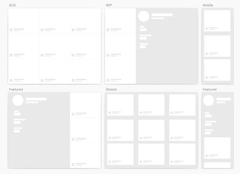
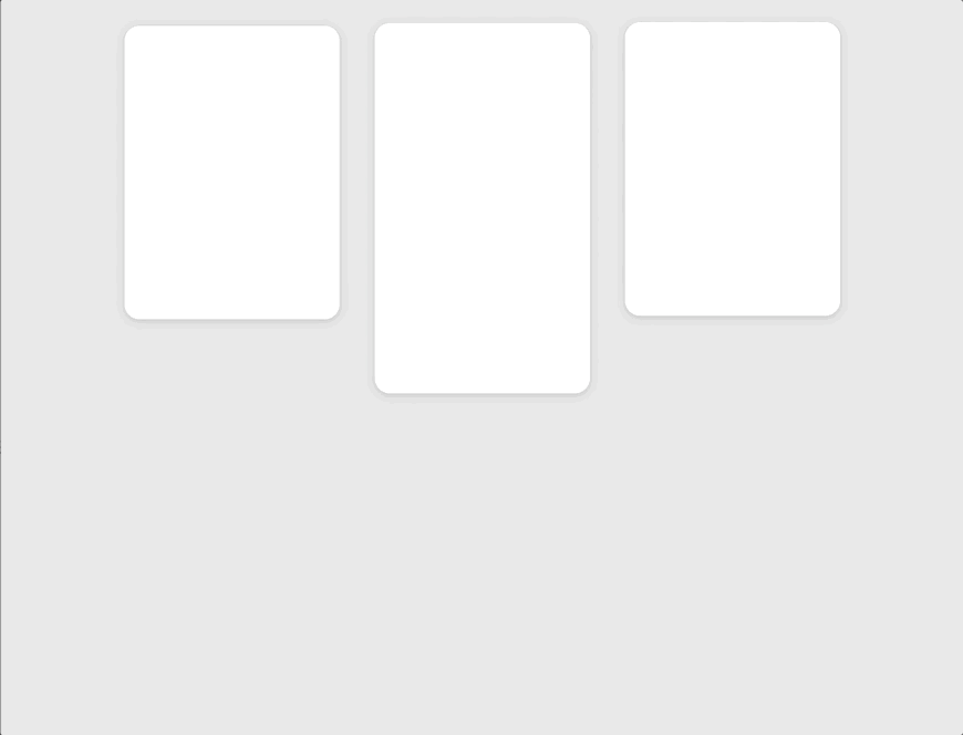
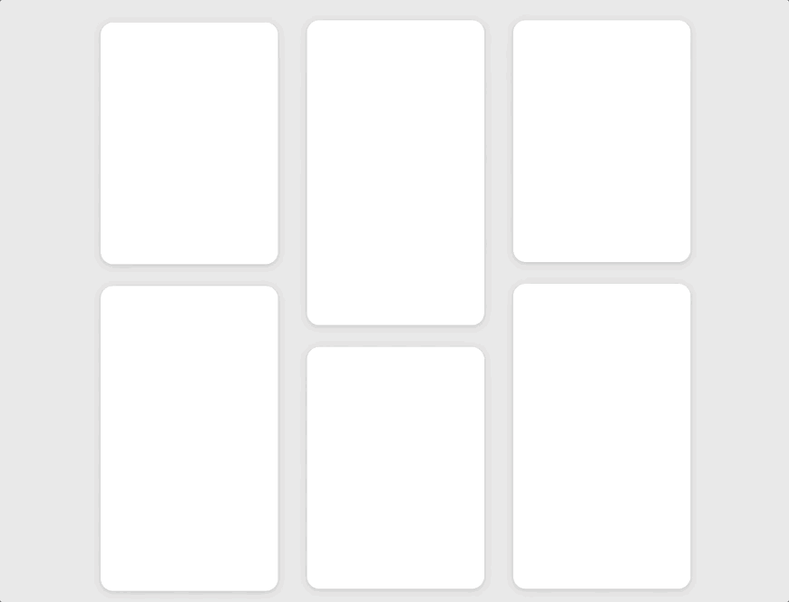
Low fi
Planning out how the content could look in different layouts. Different layouts may be used depending on size of screen / type of content being shown.
Motion design
The success of this design relied heavily on digital storytelling through the use of motion.
By carefully choreographing how content enters the page and moves, the user is intuitively guided as to what type of data is being displayed. Following the established convention that new content is always on top.
In the command center experience, where users have no interactive device to click buttons or request new content, motion is paramount in delivering a fluid and intuitive user experience.
Gif showing how new content animates from above, pushing older content out of view.
The view might not always be a feed, showing the most up to date, another usecase to follow is a ranked / curated list of important posts.
For this, the animation stratagey changes, and posts are numbed and animation now works like a virtual camera, moving content into view and seieng items lower down the list.
Gif showing the list view, content animated up into view to slowly see content lower down the list.
Research / Usability testing
At the start of the project we created a list of 20 key problems with the current implimentation. Using the low-fi concepts, we reached out to internal users and a few customers to understand if the designs we were suggesting helped solve their issues.
Adding the fideility
While each card might look like a twitter post, the content can come from anywhere. Facebook, Insagram, News Site, Blog, LinkedIn, 4chan, Reddit, Litrally any where.
The design of the content card needed to work with lots of different types of content, understanding what meta data was available allowed me to design different layouts for all posible content options.
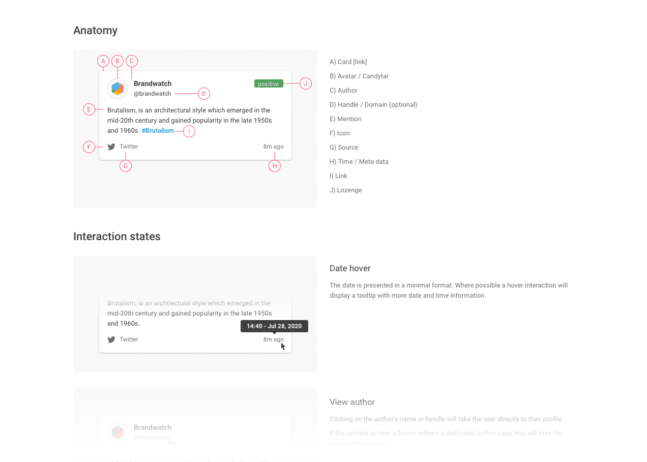
Image showing content card — A collection of names, text, icons. With a breakdown for anatomy and interaction states.
Final Designs
After about 4 months, the project was complete, designs delivered and developement complete.

Image showing content card — A collection of names, text, icons. With a breakdown for anatomy and interaction states.
Video showcasing the animation to scroll to new content using react spring for fluid animations.